In this article:
- Where is it?
- Text field
- Drop down field
- Radio field
- Textarea field
- Date field
- Password field
- File field
- Matrix field
- Previewing fields
Where is it?
You can set a data type for any field in the Form Editor:

| We’ll show the Attendee form editor here, but this tool is available in all MeetMax forms. |
In the Form Editor, the Type column has an Edit icon for every field. Locate the field you want to change, and click that icon:

| A few of the default fields can’t be changed. In those cases, you won’t see the Edit icon. |
When you click the Edit icon, you'll see the Type menu, where you can choose a field type:

See the sections below for more details on each option.
Text field
This is a commonly-used field, for a single line of text:

Settings for Text fields
- • Hint: You can add a brief description of the data this field needs. The Hint displays on the public form, either under the field or as a pop up when someone hovers over it.
- • Default: Text you add here will pre-fill the field (but it's still editable).
- In this example, all attendees of an event will be New York-based, so in the State field we’ve pre-filled a default of “NY:”

- • Validation: Sometimes, it’s helpful to set a Text field so it only accepts a specific kind of input. This setting lets you choose the type of data the field will accept. You can also customize the error message that displays if someone enters the wrong type of data:

Drop down field
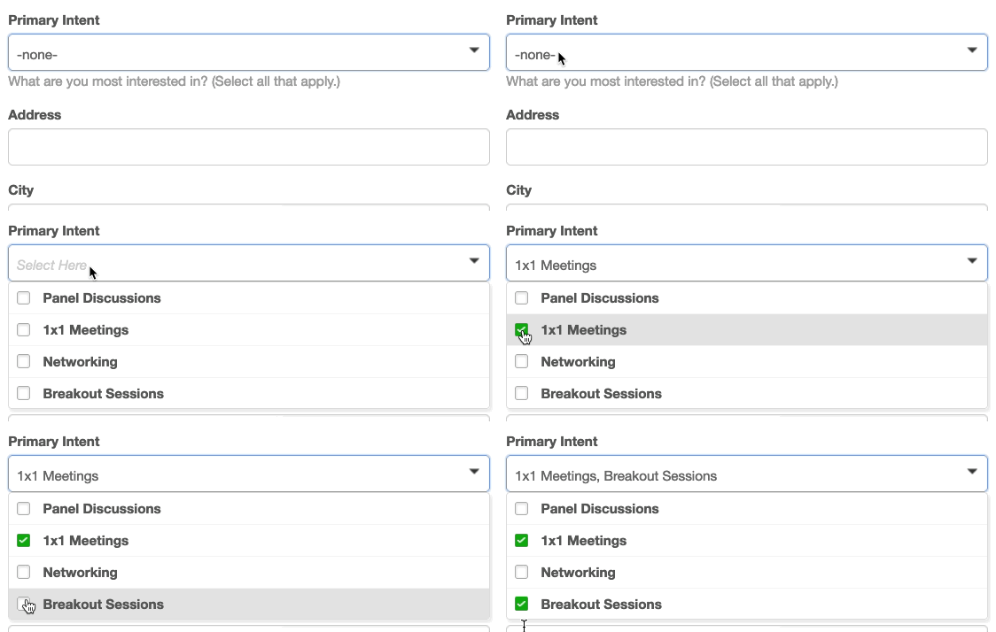
A Drop down field offers a list of choices, and your users can choose more than one.
You can set this field up to display either as a drop down list or a check box list - both are shown below:


Settings for Drop down fields
- • Hint: You can add a brief description of the data this field needs. The Hint displays on the public form, either under the field or as a pop up when someone hovers over it.
- • Allow multiple selection: By default, this field allows one choice. Use this checkbox to override that.
- • Display options as checkbox list: By default, this field displays as a drop down list. Use this checkbox if you'd rather have the options display as a list without the drop down.
- • Value and Label: You’ll be prompted to add these for each option your field offers. The Value is internal, and the Label appears on the public form.

Radio field
With a Radio field, you can offer a set of options and collect a single choice:

As with the Text field, you can add a hint that displays on the form.
For each option enter a Value (internal, no spaces) and a Label (public view). If you like, you can use the Default column to pre-select one option:

Textarea field
This field works much like a Text field, but it accepts more information:

As with the Text field, you can add a Hint and a Default input if you like:

Date field
The Date field accepts only dates as input. MeetMax adds format instructions automatically:

You can add an additional Hint if you like:

Password field
The Password field automatically masks any information as it’s entered:

MeetMax adds a Hint by default, but you can edit it if needed:

File field
This field type allows your participants to upload a JPG or other file. It’s especially useful for logos and profile images:

You won't see this field type in the default options. It's available when you're creating a custom form field:

| MeetMax currently supports JPG and PNG images. We’ll adjust the resolution of uploaded images so they always load quickly on web pages. |
Matrix field
This is another field type you can access as you’re creating a custom form field:

The Matrix field lets you capture a more complex set of choices, using your own criteria. Each row has radio buttons, so your attendees can make one selection per row:

Settings for Matrix fields
- • Categories: These are the titles on the rows of your matrix.
- • Value and Label: For each column of your matrix, you'll add both. The Value is an internal label, and the Label appears on the public form.
- You can add as many rows and columns as you need:

Previewing fields
Want to see the result of your changes? First be sure to click Save. Then click the View Sample link:


